Creating a website for your business should be the no.1 priority for every entrepreneur out there. However, just setting up a plain page with a few bits of content here and there isn’t enough to help it succeed. For a website to become a successful, powerful branch of your company it needs to provide value, be user-friendly and visually appealing.

For creating and designing a website that truly represents you and your brand, you need to have all your design basics in order.
If the word design seems scary and too far-fetched for a pretty modestly creative business owner like yourself – it’s usually because it’s true. A design is an ever changing, complex, multilayered and multidisciplinary type of art, and conquering its depths requires time, effort, talent, and dedication.
Now, let’s get to the good news – you don’t need to know all of that to create an amazing website. Apart from getting to know a few basic terms and rules, the only thing you need to design an amazing website is a passion for your business. SITE123, an amazing free website builder, has a great article on this topic. Take a look at how dozens of different people used a few basic design principles to create incredibly successful websites for their businesses with SITE123.
A few minutes to spare and a quick Google search will provide you with all the design tips and tricks you need to create a professional website. But what about all those fancy design teams you just can’t wrap your head around? Don’t worry, we’ve got you covered. Here’s a brief beginner’s guide to the 10 essential design terms every business owner should know about.
1. Alignment

Used to describe the positioning of all of the elements comprising a design, alignment is often used by the web and graphic designers alike to create structure and order on a web page. However, this doesn’t mean that the entirety of your website has to be perfectly aligned and in order. Just the contrary – breaking such a pattern creates movement, makes the content stand out and creates a much more engaging visual experience for your visitors.
2. Typography
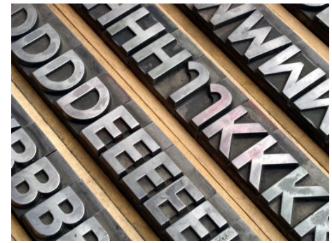
Originally used to describe the work of setting and arranging types and of printing from them, typography in design refers to the art of arranging letters, symbols, and words in a design. Typography plays a huge role in how people perceive your brand’s message. You can get creative with it, play with different fonts, sizes and colors to give your content structure and texture.
3. Kerning
While we’re on the subject of fonts, kerning is another term you’re bound to come across in the design world. Kerning often referred to simply as character spacing, is the space between two characters. While it might not seem like a vastly important thing, kerning is the number one factor in determining how easy your typography is to read.
4. Leading
Another seemingly unimportant design term, leading is the spacing between two lines of text. If your website features large bodies of text, leading is a pretty important element you shouldn’t overlook. Play with kerning and leading to accentuate certain parts of your text or achieve a playful and fun effect.
5. Lorem Ipsum
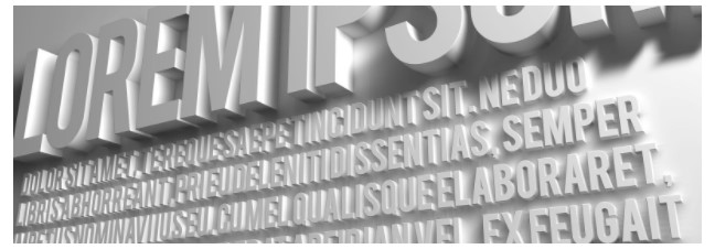
The dummy text used to offer a preview of what a larger body of the text would look like, lorem ipsum has been around since the 1500s! Taken from one of Cicero’s less famous speeches, lorem ipsum stood the test of time and found its place in the digital world.
6. Google Fonts
Loved both by design veterans and novices to the trade, Google Fonts are an all-encompassing font base that’s free for everyone to use. Whether it’s a personal project or a more commercial endeavor, this font base is something you’re bound to come across.
7. Opacity

Moving on from fonts to images, opacity is another design term you’re bound to encounter. It’s used to describe how transparent an object or an image is. So, the higher the opacity, the more transparent it is. Play with the opacity of the elements on your website’s page to achieve a look that suits your brand best.
8. Duotone
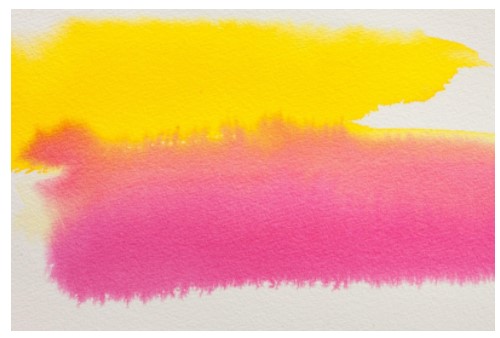
While this one is pretty self-explanatory, it won’t hurt to dwell a few seconds longer on this particularly interesting design term. Any image or element consisting of two contrasting colors is considered a duotone. A vivid duotone image on your website’s homepage can be a great way to introduce your brand’s color scheme to the rest of the page.
9. Negative space
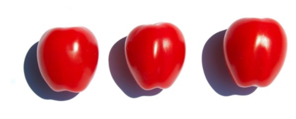
Negative, or white space as it’s often referred to, is all of the white, ‘unoccupied’ space surrounding elements of your website. Clever use of negative space can do more for your website than any other piece of content you upload. Use it to draw your visitor’s eyes to a particular element, word or image.
10. Minimalism
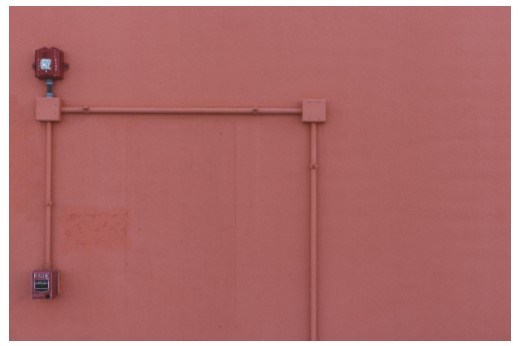
Stemming from industrial and interior design, minimalism is a concept that has successfully found its way into web design.
Minimalism implies less content, but not on the expense of aesthetics. It accentuates functionality and creates a sleek, modern, attention-grabbing look with just a few basic, monochromatic elements.
Conclusion
Now that you’ve got all of the basics covered, creating amazing design doesn’t seem so far-fetched now, does it? Before you start working on your new website, take a quick look at these basic pillars of design and fuel your creativity with the passion and dedication you have for your business. After all, it’s all it takes to create an amazing successful website that will help your business succeed.
