Best Email Signatures
Everyone talks about making a good first impression, but researches show that when dealing with emails, it the last impression that sticks. Wondering what we’re talking about? Your email signature of course. Now ideally you’d just want to put in your name and phone number in your signature, but in today’s world sometimes that just isn’t enough, keeping in mind how social networks are becoming increasingly important on the whole business scene, you’d probably need to link your social networks, your website(s), your YouTube channel, or anything of the kind. Now, this may sound easy, but there are a thousand ways in which you could go wrong here, bearing that in mind here are a few tips to help you make your email signature kick ass.
Best Email Signatures

1: Limit your signature to 3 or 4 lines
As said earlier, all you essentially are
- Your name
- Title, Company (Link a website if your company has one)
- Your Phone number
That’s literally all there is to it. No complications, nothing extravagant just plain, simple and easy on the eye. Here’s what your signature might look like once done:
Abhinav Nair,
Senior Editor, Techonloop.
123-456-789.
Once you’ve got the basics right you can move on and consider adding one or two more details to make your best email signatures a bit more personalized.
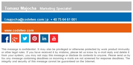
2: Don’t shy away from including Social media links
Now your job may require you to link your LinkedIn profile, or maybe you’d want potential job candidates to contact you on Facebook, whatever the case, linking your social media profiles on your signature is never a bad idea.
Now if you don’t already know how to do this, worry not, because we’re here teach you how.
- Getting the buttons in place.
Firstly, you’ll need the icon of the social network you intend to sink in. A simple Google search should help you with that. Or if you know a graphic designer by chance you could simply ask them to help you out.
- Inserting the buttons into your signature
Once you get hold of the icons you need to insert them into your email signature.
Now there are two different ways to handle this, and both vary on the email client you are using. If you use a client that includes a WYSIWYG HTML editor (that’s What You See Is What You Get, for the uninitiated) like Gmail or Outlook all you have to do click on the “Insert Image” option and insert and place the image.
Whereas in cases where only plain HTML code is accepted (Like Office 365, Exchange Server) you’ll have to use the IMG HTML tag to point to the online location of the image, it may well end up looking like this.
<img src=”http://www.mail-signatures.com/articles/wp-content/themes/emailsignatures/images/gplus-35×35.gif”>
- Making it click
Now there’s no point of having the image there if it isn’t even clickable right? So what you need to do now is hyperlink the image to the social media page you want to show.
Again, this is fairly simple to do if you’re working with a WYSIWYG HTML editor. All you have to do is select your image and click on the “Add a hyperlink” button and add the link to your social network.
In the other case you’ll have to use the code <a href=…> <a> around the location of your image and the link 0f your website. Here’s an example
<a href=”http://www.facebook.com/Techonloop”><img src=”http://www.mail-signatures.com/articles/wp-content/themes/emailsignatures/images/facebook-35×35.gif”></a>
And that’s it! You should have a working social media button in your signature now. Now keep in mind that overdoing it here might just kill your case, nobody likes a cluttered signature, so KEEP IT SIMPLE and link in only those networks that you really need.
3: Get a Selfie in there
It’s a known fact that people remember visuals better than words, faces all the better and there it’s always good to include a picture of yourself alongside your signature. Nothing too flashy, and definitely no pictures of the infamous dog filter from Snapchat! Just a nice picture of you all smiles will do wonders, believe us.
4: try using a “Sent from my iPhone” if you’re someone who always ends up making silly errors
Now this one’s a bit tricky to get away with. While many people are bound to have gone through the same troubles with their iPhones and will sympathize with you, many will consider this to be some kind of a brag. And there is just a fine line between the two.
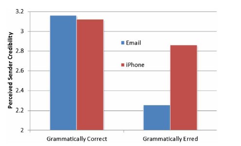
But studies do show that when sent to this little analogy sent to the former is almost as good as a get out of jail free card in Monopoly. Literally, any errors you make, you can get away with if you put in this 4-word disclaimer in your signature.
Here’s a graph that proves that.

After all, when have graphs ever let us down?
The key here is knowing who you’re dealing with if you feel you’ve made some errors and the recipient will be willing to let one pass, add in those 4 magic words to your signature and see the magic unfold. Obviously, you don’t have to stick to what we said and can experiment around with some of your customs made best email signatures. Here are a few witty examples courtesy of yesware.com:
- Sent from a phone. Regularly foiled by autocorrect. But duck it.
- *Brevity and errors aided and abetted by my beloved iPhone*
- From my smartphone so please forgive any dumb mistakes.
- iTypos. I apologize.
- [Name] sent the message. iPhone sent the typos.
- Please excuse any typos as it was sent from my iPhone.
- Sent from my iPhone. Forgive the brevity, the typos and the lack of nuance.
- Sent from a mobile device, all error self-inflicted.
Conclusion: Best Email Signatures
Those were some tips that are bound to help you make the best email signatures but if you prefer the more direct option, a.k.a. lazing around while someone else does the business for you then here are some websites you can try out that make your signature for you:
- Hubspot
- Wisestamp
- NewOldStamp

